Campbell’s Organic Kids
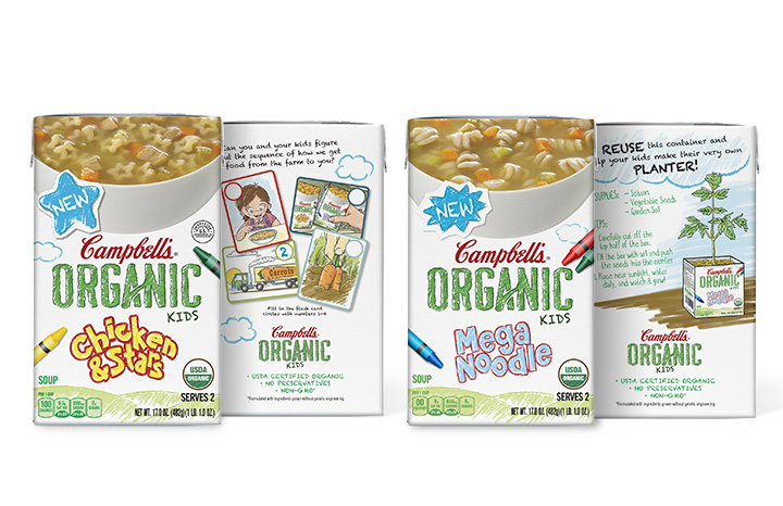
We were tasked with re-branding the Campbell’s organic soup line to a “kids” version. The direction was to make the packaging more fun and colorful to appeal to kids. This was done by making all the elements on the package with the exception of the soup photo and Campbell’s branding appear to be drawn and colored in crayon while still leveraging the “Organic” design and branding. I also produced the illustrations on the rear of each package.